UI Navigation - Android

Up vs. Back or in other terms hierarchy vs. chronology is one of the User Experience aspects touched upon in my post UML: Modelling User Interfaces Part 1 – Hierarchy and Navigation. The Android methodology for UI navigation has received some attention over the years and the largest change to date was brought in with the introduction of the Action Bar as part of Android 3.0+.
Pre-3.0, Navigation would occur as a result of widget interaction (forward nav) and the system Back button or user defined Back widget (backward nav). Post-3.0 the Action Bar now offers an Up button in addition to the previous Navigation methods.
The Up button is used to navigate within an app based on the hierarchical relationships between screens. For instance, if screen A displays a list of items, and selecting an item leads to screen B (which presents that item in more detail), then screen B should offer an Up button that returns to screen A.
If a screen is the topmost one in an app (that is, the app’s home), it should not present an Up button.
The introduction of the Action Bar and the Up navigation method is no news, so why am I posting about it now? The Google documentation of Android Navigation goes to some length to describe and clarify the current situation. I feel the information presented there resonates with some of the points made in my post that I shall explore further
Navigating to screens with multiple entry points
Sometimes a screen doesn’t have a strict position within the app’s hierarchy
Indeed! I wish I had been able to capture this point so saliently. The concept of an always available page runs counter the that of a fixed hierarchy and yet it is a very common use case. Following the advice of the Android documentation, back or up should return the user to where they previously came from, in a tree-like hierarchy this could only be achieved by having the page as a child node of every node. This sets some warning flags regarding duplication.
Changing view within a screen
Changing view options for a screen does not change the behavior of Up or Back: the screen is still in the same place within the app’s hierarchy, and no new navigation history is created.
Obvious? This can be treated as an internal state change. Some actions are clearly an internal change but are they all, this is very much a UX issue and the actions/outcomes should match the user expectations. The decision as to whether to keep the behavior internal or cause a navigational transition is debatable and often an area for user feedback and iteration. One approach would be to look at this from a function/non-functional change perspective - does the action cause a change to the current function or user sequence?
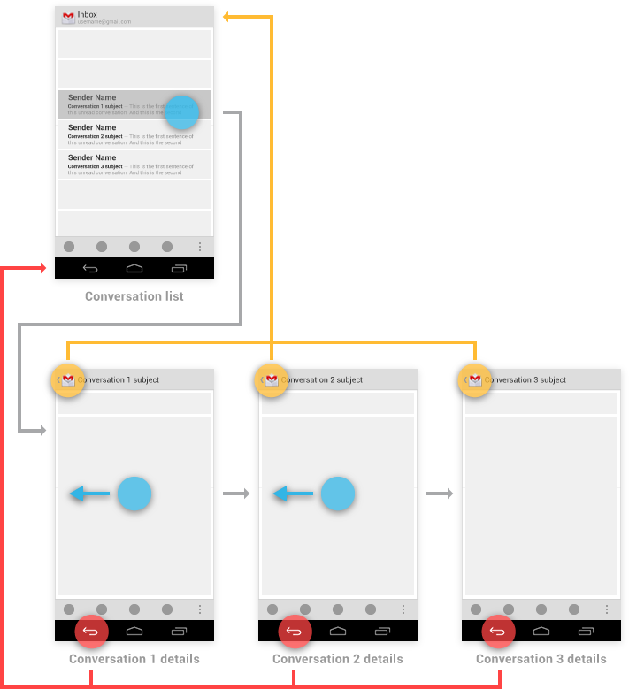
Navigating between sibling screens
When your app supports navigation from a list of items to a detail view of one of those items, it’s often desirable to support direction navigation from that item to another one which precedes or follows it in the list.
This is personally the most interesting point of the article, the concept that navigation between siblings is neither a hierarchical or chronological navigation action. On first site this may be difficult to articulate to a user, designer or implementer, however, in real term usage there are many straight forward use cases e.g. viewing multiple photographs one-by-one in an image gallery, or selecting between songs in a music player. The Android article does highlight where the alternative approach is used and it is a legitimate case. The selection of implementation is therefore quite tricky and should be done to best provide affordance to the user.
Looking at this from a tree-like hierarchy perspective, the notion of sibling-to-sibling node navigation (and the notion that Up or Back should operate independently of the nodes) is something that breaks the rules.
Summary
Hierarchy Navigation on the Android platform was enhanced with the introduction of the Up button in version 3.0. Android documentation provides guidance and clarification on the UI in order to provide the best UX. The documentation provides several examples that resonate with concepts raised in my earlier posts. The main theme of these is that a strict, rigid Hierarchy is not rich enough to articulate the nuances of everyday device and app usage, not convoluted applications but intuitive ones. From the perspective of a tree-like hierarchy, several elements bend or even break fundamental rules and pose the question “Is the Tree fuzzy enough to accommodate me comfortably?”